14 April 2015
It's All About the Looks
We all enjoy reading reports with lots of facts and figures and numbers and statistics, right? Wading through stacks of paper, trying to make sense of it all, who doesn’t love that? If this first sentence describes you to a tee, you may want to consider stopping here as this article is not for you.
Now, for all us normal people, processing complex information is not all that much fun, and working out relationships and patterns can be challenging. If only there was an easier, better way…. Hello, infographics!
What is an Infographic?
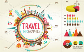
Infographics are specifically designed to help people interpret and process complex information quickly and easily. In fact they are defined as: “graphic visual representations of information, data or knowledge intended to present complex information quickly and clearly”. Most people know, and several studies have proven, that as much as 90% of the information people remember is based on a visual impression. We humans like to scan things as opposed to actually reading stuff.
Infographics are not actually a new thing; the London tube map is a great example of an infographic as it is not an actual, factual map, but rather a graphic illustration to give a relatively easy to understand overview of the complex underground network and its myriad stations. If you find the tube map difficult now, imagine you had to figure it all out from architect’s drawings and work-plans!
So having been around for a while, they have recently come back into vogue due to the advent of social media, as they are simply a great way to easily share information with people, and as they can look very pretty, they are social media sharing gold!
What makes a Good Infographic?
So much so, in fact, that these days to create a good infographic you need focused data (the subject matter), a clear design (the format of communication) and a shareable story or a viral title to help you spread it via social media.
When it comes to the data it needs to be relevant and accurate (obviously), but it is essential to make sure that the data used is relevant to the message, i.e. what you want to convey. Any data that does not relate to your message should not be included, so your message is clear.
The same applies to the design; you shouldn’t use too many colours and keep it simple. The whole point is to allow people to easily take in the information that you are presenting, so using data visualisation is a must. It is also important to keep it relatively small; if it is too big, it will be too difficult for people to take it all in effectively.
When it comes to sharing, a catchy title will help, or a popular yet often misunderstood subject matter are perfect to use. Take, as an example, this infographic about super-popular TV series Game of Thrones. It is an easy-to-use, clear, reasonably pretty overview for you to finally make sense of who is who. Until they get killed off, of course…
The next time you have a set of data to convey (in an annual report for example), consider the use of infographics, the reader might even thank you for it!
BACK TO LISTING
Recent Newsletters
Get satisfaction!
24 July 2017
Adding value to a legal practice
21 July 2017
Industry 4.0: the game is changing
20 July 2017
Sell The Sizzle Not The Sausage!
20 July 2017
Is Print Media Dead?
29 June 2017